 | ||
| A VIVID STORE FRONT IN LAS VEGAS, NM, 2010 |
Thursday, May 17, 2012
JUMPING INTO BOLD COLORS


Tuesday, May 15, 2012
CONTINUING ON MY RAILROADING THEME
 | ||
| BNSF AT SANDCUT, CALIFORNIA, 2006 |
 | ||
| SATURATED SANTA FE |
Saturday, May 12, 2012
LISTEN TO THE COLD STEEL RING
 | |||
| STEEL ON STEEL, LOCOMOTIVE BRAKES AND DRIVERS, 2011 |
This image was processed entirely in Lightroom 4. I seldom work in Photoshop unless I need to do some cloning or healing to remove aspects of a composition.
Wednesday, May 9, 2012
LOOK HERE!
 | ||
| SHAPES, FORMS, AND MUTED COLOR ON A GRAY DAY IN FORTUNA |
I was drawn to the symmetrical as well as the asymmetrical aspects of these structures. The concrete curbs are mirrors of shape, but not scale.
Monday, May 7, 2012
SUNNY DAYS
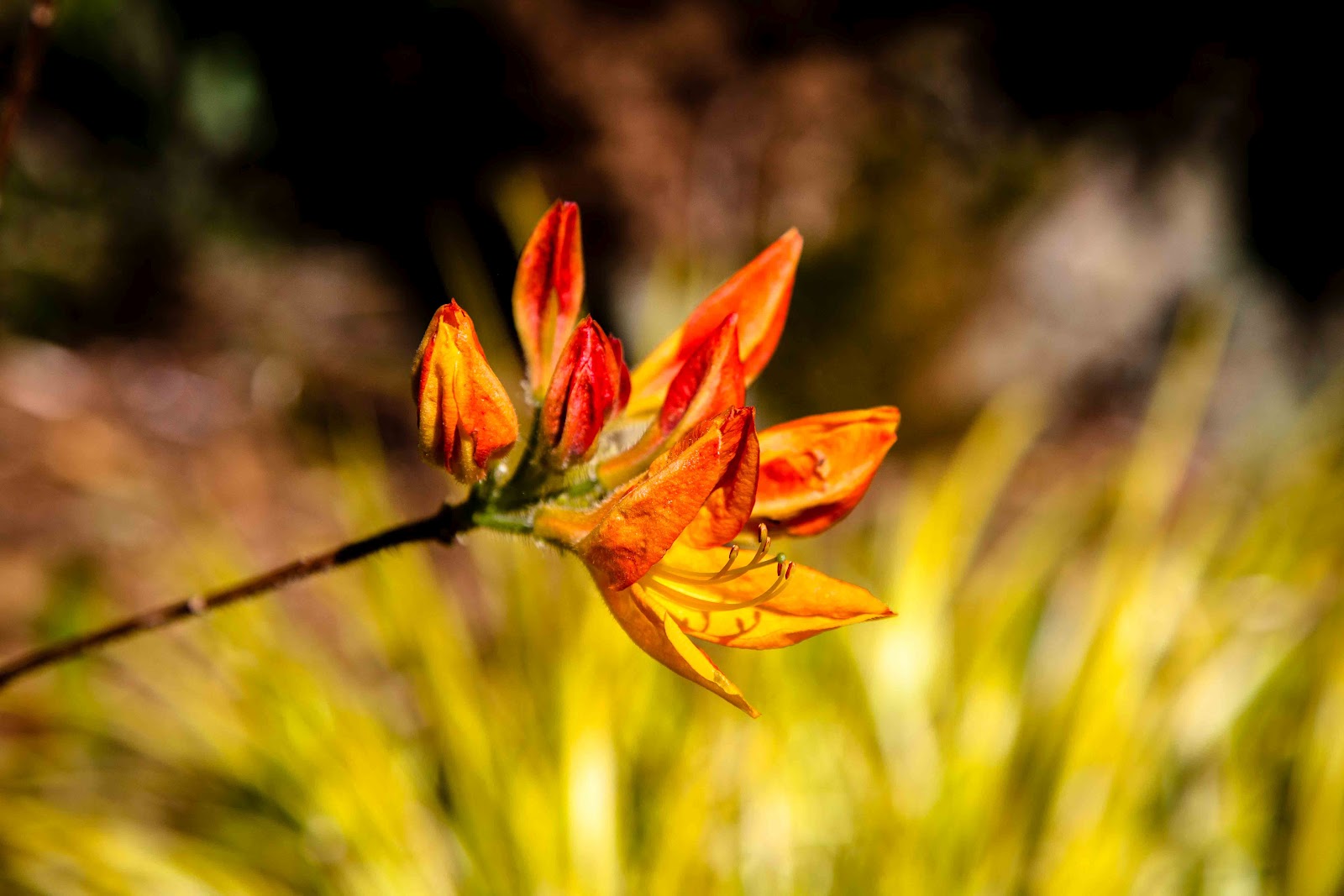 | ||
| IN LISA'S GARDEN |
Sunday, May 6, 2012
A DIFFERENT WAY OF SEEING
 | ||
| A STAR IN THE EVENING |
Thursday, May 3, 2012
THIS JUST MAKES ME HAPPY!
 | ||
| THE EDGE OF THE FOREST, PRAIRIE CREEK, 2010 |
Wednesday, May 2, 2012
TEACHING AN OLD DOG
 | ||
| Wind Swept, Patrick's Point State Park, 2010 |
I think one of the best things that I ever did for my art, was to join the Redwood Art Association. Thorough the RAA's venues, I was afforded public gallery space in which to present my work. And through the RAA I received valuable feedback on my photography. I am sure that my work has hung in at least a dozen RAA shows over the course of the past three years.
Last year I joined the Humboldt Arts Council, The Eureka Photoshop Users Group, and the Redwood Camera Club. I feel that my association with these groups is, each in their own way, just as valuable as my association with the RAA.
I currently have a space in the downstairs of the Morris Graves Museum of Art where examples of my work that are on display. I am honored that I was accepted as a featured artist in their space for retail art.
My experience with the Redwood Camera Club or RCC, is one that is very important to my development as an artist. There are some very talented photographers in that group, and they seem to be very willing to share their expertise with newcomers like me. I look forward to each meeting and critique.
I must also mention the Eureka Photoshop Users Group. I value the level of the presentations, and I feel that my skills within my craft are growing as a result of what I glean from each session. I look forward to each session.
What my title refers to is that I am learning like crazy. I am having a wonderful time honing my skills, learning new aspects of my art, and establishing friendships. All-in-all a pretty cool way to spend my "golden years".
Tuesday, May 1, 2012
BOLD SHAPES AND COLORS
 | ||
| FORTUNA RECTANGLES AND SQUARES, APRIL 2012 |
Monday, April 30, 2012
POKING AROUND FERNBRIDGE AND PHOTOGRAPHY AS ART
 | ||
| RED ON GRAY, FERNBRIDGE, APRIL, 2012 |
I am pondering the notion of Limitations as it applies to photography. My thesis goes something like this: Why is it considered "bad taste", or "gimmicky" for photographers to make "over-saturated" images? I just recently heard that a photographer, whose work I very much admire, was criticized for using too much saturation in his prints. I get it that if the criticism was because of the personal taste of the critic - that it could be a valid critique. But I ask "would the same critic have felt that way with an oil painter's interpenetration of a similar subject matter"?
I think that there are several types of photography, and they have completely different intended purposes. The documentary style of photography that one would see in journalism is a valid style, and it is one that I feel should be accurate in how it conveys its message. A journalistic photograph is supposed to represent the truth of the subject in an objective manner. I think it is downright dishonest to present something as being factual that has been altered.
Here is my point about photography as art. I assert that photography that is presented as art, and is intended to be presented as such, should be free of the biases that so often are applied to photographic works. Just because the title card has the word "photograph" written on it does not mean that the piece "has to meet certain arbitrary aesthetic standards". A work that is an interpretation of a subject regardless of the medium, should be judged as it is, - an image hanging on a wall. I think viewers and critics should let go of first establishing how an image was created, and focus their attention on the piece. I do not think that there is a standard for water color painters that penalizes for "over saturation" so why are photographer's slammed for using strong or unnatural colors?
I of course, acknowledge that a bold pallet in and of itself, will not make a strong image. But I do feel that the artist no matter what medium they use, should feel unrestricted by the rules they learned. Art is about freedom of expression. Art is about discovery. Art is on the leading edge of human creativity. Great artists know the rules, but are not bound by them. There art may lead us to new discoveries, and open our eyes to new possibilities.
Sunday, April 29, 2012
WHITE ON WHITE
 | ||
| HOBBLED, KARZOK, LADAKH, 2008 |
At first I thought it was cruel to do that to this horse, but then I realized that if it ran away that the people who owned it would be deprived of their means of support.
Friday, April 27, 2012
PRINTING FRENZY
 | ||
| AURORA BOREALIS AND THE CYCLONE, EUREKA, 2010 |
Subscribe to:
Posts (Atom)